Description
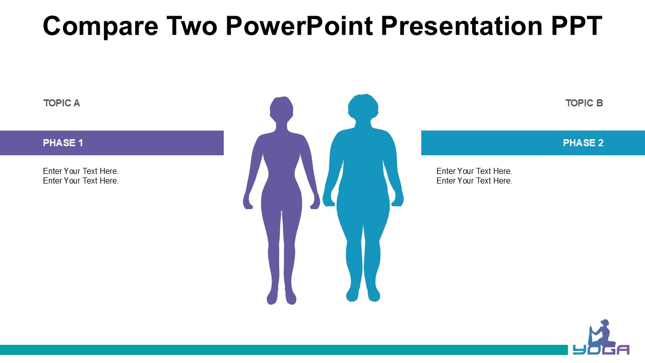
When it comes to creating impactful presentations, having the right PowerPoint template can make all the difference. Let’s compare two popular PowerPoint presentation templates to help you decide which one is best suited for your next project.
The first template, let’s call it Template A, is a sleek and modern design that features clean lines and a minimalistic layout. It is perfect for professionals looking to create a polished and professional presentation. With a monochromatic color scheme and subtle animations, Template A is great for presentations that require a sophisticated look.
On the other hand, Template B is a vibrant and colorful design that is sure to grab the attention of your audience. With bold graphics and eye-catching visuals, Template B is ideal for creative individuals who want to make a statement with their presentations. This template offers a dynamic and energetic feel that is perfect for projects that need a bit of pizzazz.
Both templates come with fully editable slides that allow you to customize the content to suit your needs. You can easily change the colors, fonts, and layouts to create a presentation that reflects your style and message. Whether you prefer a more traditional look or want to inject some personality into your slides, these templates offer the flexibility to do so.
In summary, Template A is a sophisticated option for professionals who prefer a clean and refined aesthetic, while Template B is a bold choice for those looking to add some flair to their presentations. Whichever template you choose, you can rest assured that you will have access to fully editable features that make it easy to create a professional and personalized presentation.



There are no reviews yet.